Colors in Art That Reflect the Changing Seasons

Colors in Art That Reflect the Changing Seasons
Color has always been one of art’s most powerful tools. It can evoke emotion, set a mood, and tell a story without a single word. Across centuries, artists have used color to mirror the rhythm of nature — the transition from winter’s quiet stillness to summer’s vibrant energy. This cycle continues to inspire painters, designers, and collectors, shaping how we experience art and even how we decorate our homes.
The Fresh Palette of Spring
Spring is the season of renewal and hope. In art, it often appears through soft, luminous tones — fresh greens, gentle yellows, and delicate pinks. American landscape painters of the 19th century, such as those from the Hudson River School, captured the awakening of nature with light-filled scenes of budding trees and clear skies.
In contemporary art and design, spring colors bring a sense of optimism and new beginnings. A painting with pastel greens and blush tones can make a space feel open and alive — perfect for rooms where you want to invite energy and freshness.
The Warmth and Energy of Summer
Summer is the season of abundance and intensity. Artists often turn to saturated hues — golden yellows, ocean blues, coral reds, and lush greens — to express the vitality of long, sunlit days. American modernists like Georgia O’Keeffe and Arthur Dove used bold color contrasts to capture the heat and movement of summer landscapes.
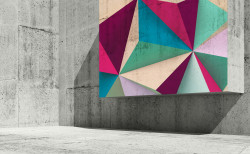
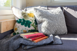
In today’s art and interiors, summer colors are used to create vibrancy and joy. A large canvas filled with bright, contrasting tones can energize a room, echoing the feeling of a sunny afternoon. Even small touches — a colorful print or a vivid throw pillow — can bring that same warmth indoors.
Læs også:
The Golden Melancholy of Fall
Autumn brings a more subdued but deeply rich palette. Warm earth tones — ochre, copper, burnt orange, and deep red — reflect the changing leaves and the quiet transition toward winter. Many American artists, from the regionalists of the 1930s to contemporary painters, have used fall’s colors to express reflection and transformation.
In home décor, autumn hues create a sense of comfort and calm. A piece of art in amber or rust tones can make a living room feel cozy and inviting — ideal for the season of gathering and gratitude.
The Calm and Contrast of Winter
Winter is the season of simplicity and introspection. Whites, grays, and cool blues dominate, often accented by deep blacks or silvers. These colors evoke stillness and clarity. Artists such as Andrew Wyeth captured the quiet beauty of winter landscapes, where muted tones convey both solitude and peace.
In modern art and design, winter’s palette is used to create minimalist, balanced spaces. A painting in cool shades can bring a sense of serenity and focus — a visual pause amid the busyness of daily life.
Colors as the Storytellers of the Seasons
When we look at art through the lens of seasonal color, we see how deeply nature’s rhythm influences our sense of beauty. Colors act as a visual calendar, reminding us of life’s cycles — from the first bloom of spring to the stillness of winter.
In the home, you can embrace this rhythm by rotating artwork and color accents with the seasons. A bright, green-toned piece in spring can later give way to a warm, golden painting in fall. In doing so, art becomes a living part of everyday life — moving in harmony with the world outside your window.
Læs også: